
Starship — Building a shared design language for Deem
A design system isn't a component library. It's a culture. Starship was built to align 15 designers and 250 developers around a shared language — creating the foundation for consistent, scalable product experiences across every platform.
The Beginning
A growing product. A growing need for shared standards.
As Deem's product scaled, teams were building well but building independently. The problem wasn't quality — it was coordination.
"We weren't building badly. We were building in parallel. Starship was the decision to build together."
— Design system inception, 2021What we observed
Similar patterns were being built independently across teams. Handoffs created friction. Onboarding took too long. No single source captured how Deem looked, behaved, and communicated.
What we set out to create
Not a UI kit. An operating system for how Deem's product teams work — connecting design, engineering, accessibility, content, and brand into one coherent language.
The Goal
A shared design culture
Give every team — design, engineering, product, marketing — a common foundation to build from. Reduce the cost of alignment. Increase the speed of delivery.
The Approach
Start with principles, not pixels
Before building a single component, we defined why the system existed — its values, its audience, and the problems it was designed to solve across the organization.
The Vision
Built to grow, not to finish
Starship was never meant to be "done". It was built as a living system — one that evolves as the product, the team, and the users evolve alongside it.
Who Used Starship
Designed for the entire organization
Starship was built for every team that touches the product — not just designers.
Designers
15 people
- Figma component libraries
- Shared theme engine
- Accessibility foundations
- Contribution workflow
- Documentation & guidelines
Developers
250 people
- Storybook component reference
- JSON token integration
- Cross-platform patterns
- Prop documentation
- Accessibility specs
Product & QA
Multiple teams
- Release consistency checks
- Behavior standards
- Accessibility acceptance criteria
- Onboarding reference
- Pattern alignment
Marketing & Brand
Stakeholders
- Brand principle docs
- Communication guidelines
- Product language standards
- Visual consistency rules
- Zeroheight access
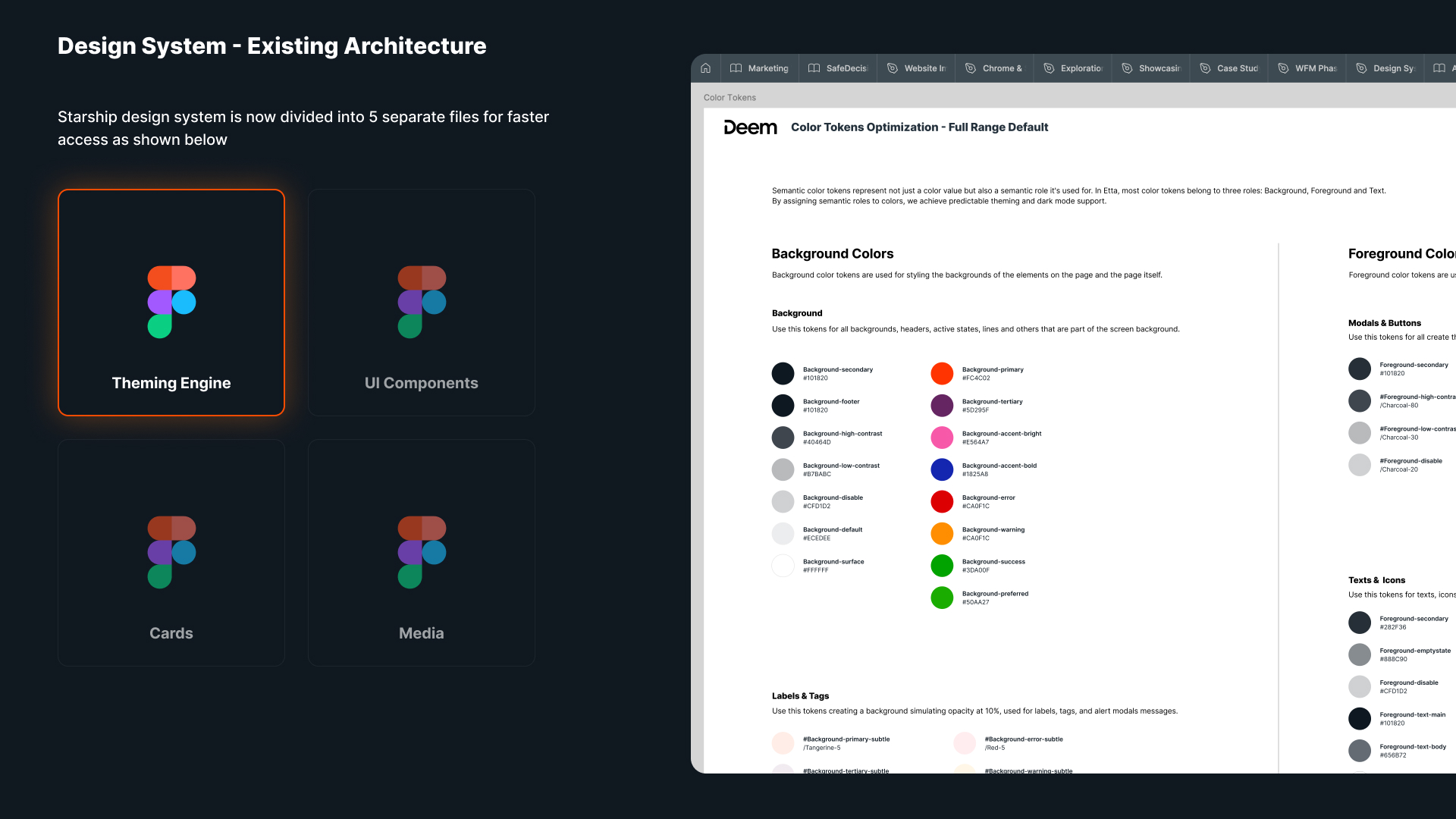
Foundation Layer
Before components. Before anything.
Foundations are the decisions everything else inherits — tokens, typography, color, spacing, and accessibility. Get these right, and the components build themselves.
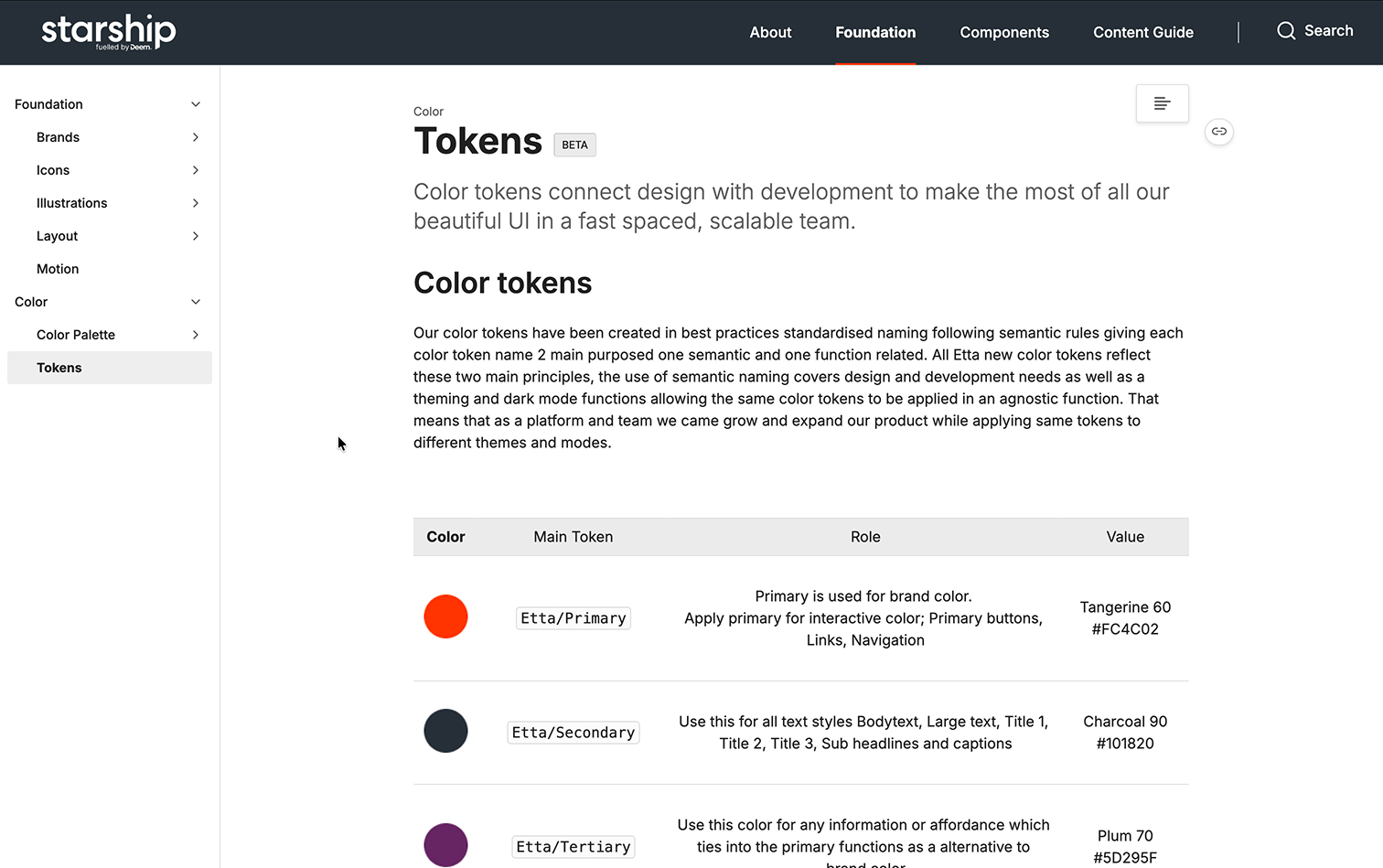
Token Architecture — Primitives → Semantic → Component tokens across all platforms
The Token Architecture
Three token tiers: primitives → semantic → component. A single change propagates everywhere — no manual updates, no missed instances.
color.purple.500 = #5340b8
color.action.primary = color.purple.500
button.bg.default = color.action.primary
Type Scale
Color System
Brand Scale
500
400
300
200
100
Semantic Roles
Success
Warning
Error
Info
Surface
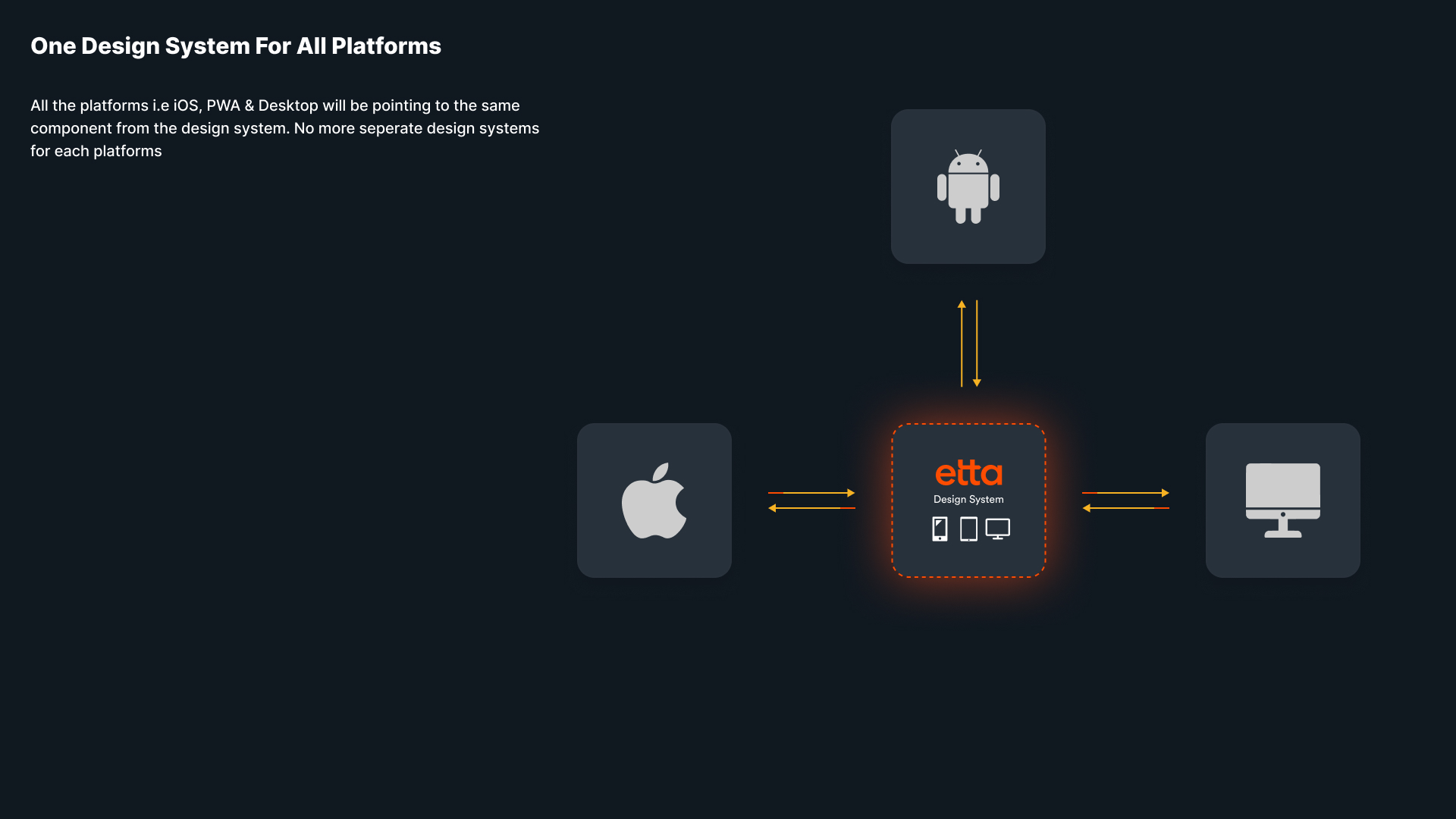
Theming Engine — Light · Dark · High Contrast · Brand themes powered by a single token layer
Design System Overview — Unified component library across Web, iOS, and Android
Component Ecosystem
Built once. Used everywhere.
Every component in Starship had to earn its place: usable in at least three places across the product. Components are investments — they should pay dividends.
Buttons
Primary · Secondary · Ghost · Destructive · Icon
Inputs
Text · Select · Date · Search · Textarea
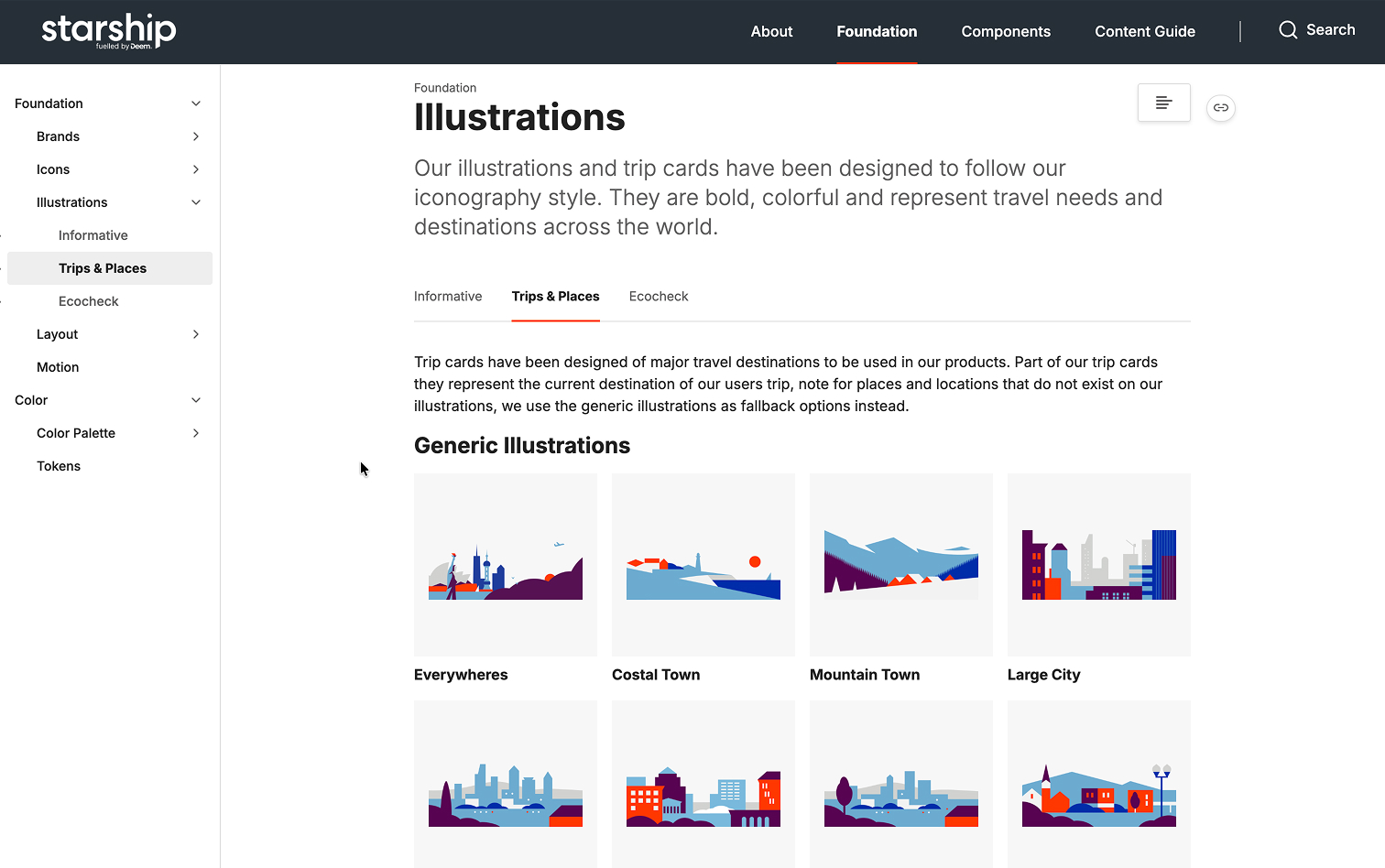
Cards
Flight · Hotel · Trip · Policy · Alert
Chips & Badges
Filter · Status · Policy · Preference
Forms
Validation · Error states · Help text
Navigation
Top bar · Sidebar · Tab bar · Breadcrumb
Modals & Dialogs
Confirm · Alert · Sheet · Drawer
Data Display
Table · List · Timeline · Stats
Feedback
Toast · Banner · Inline · Progress
Date & Time
Calendar · Picker · Range · Time
Loading States
Skeleton · Spinner · Progress · Shimmer
Accessibility
Focus rings · ARIA · Skip links · Screen reader
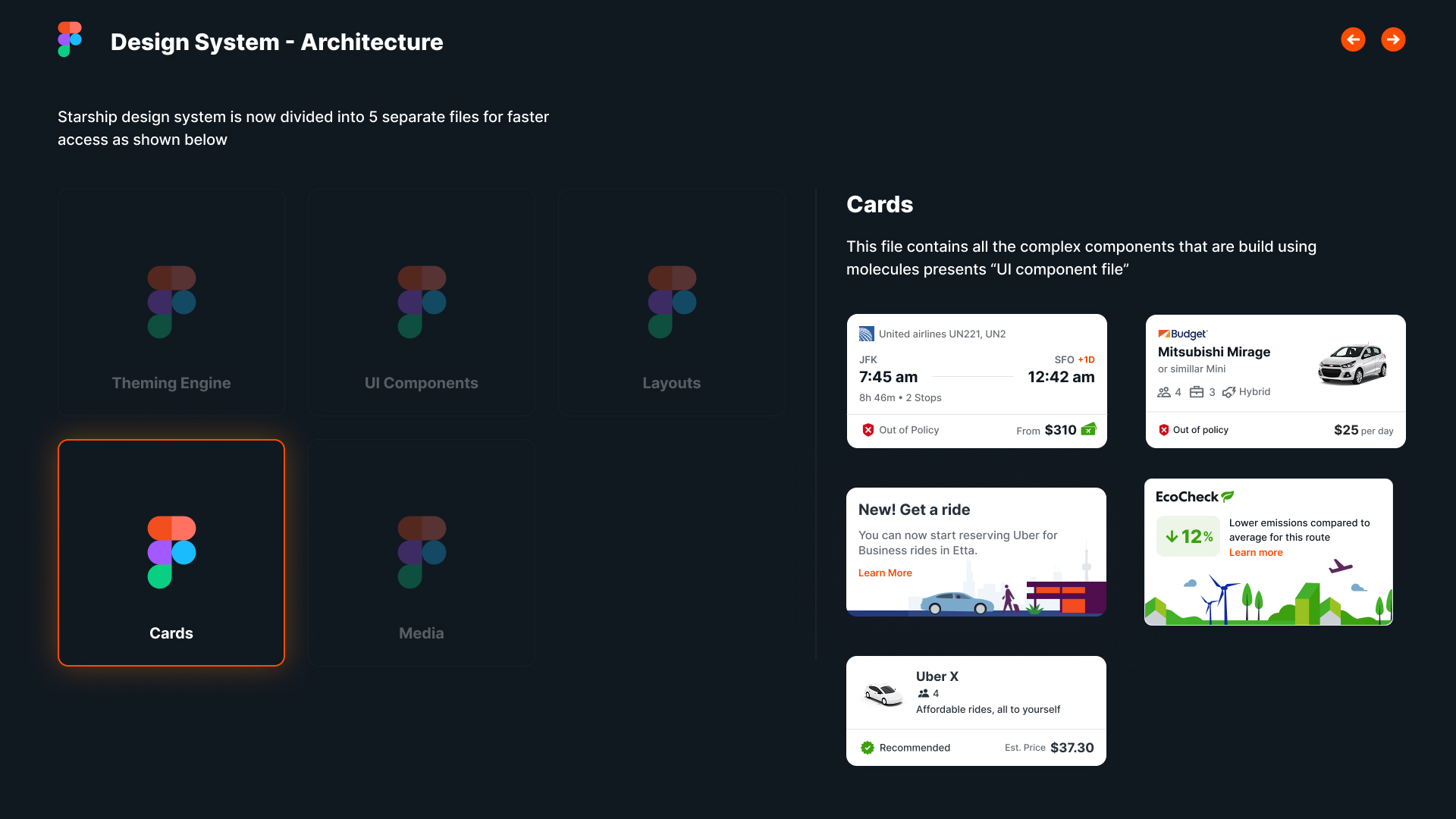
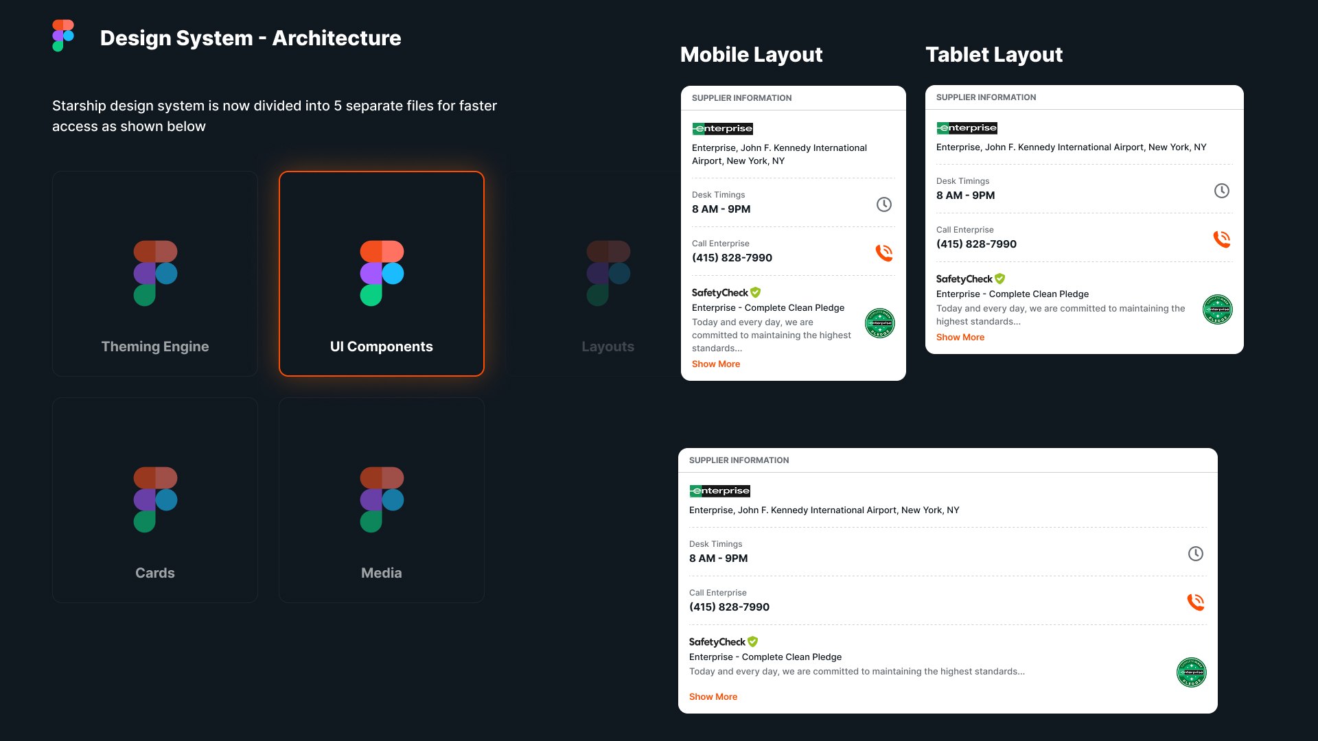
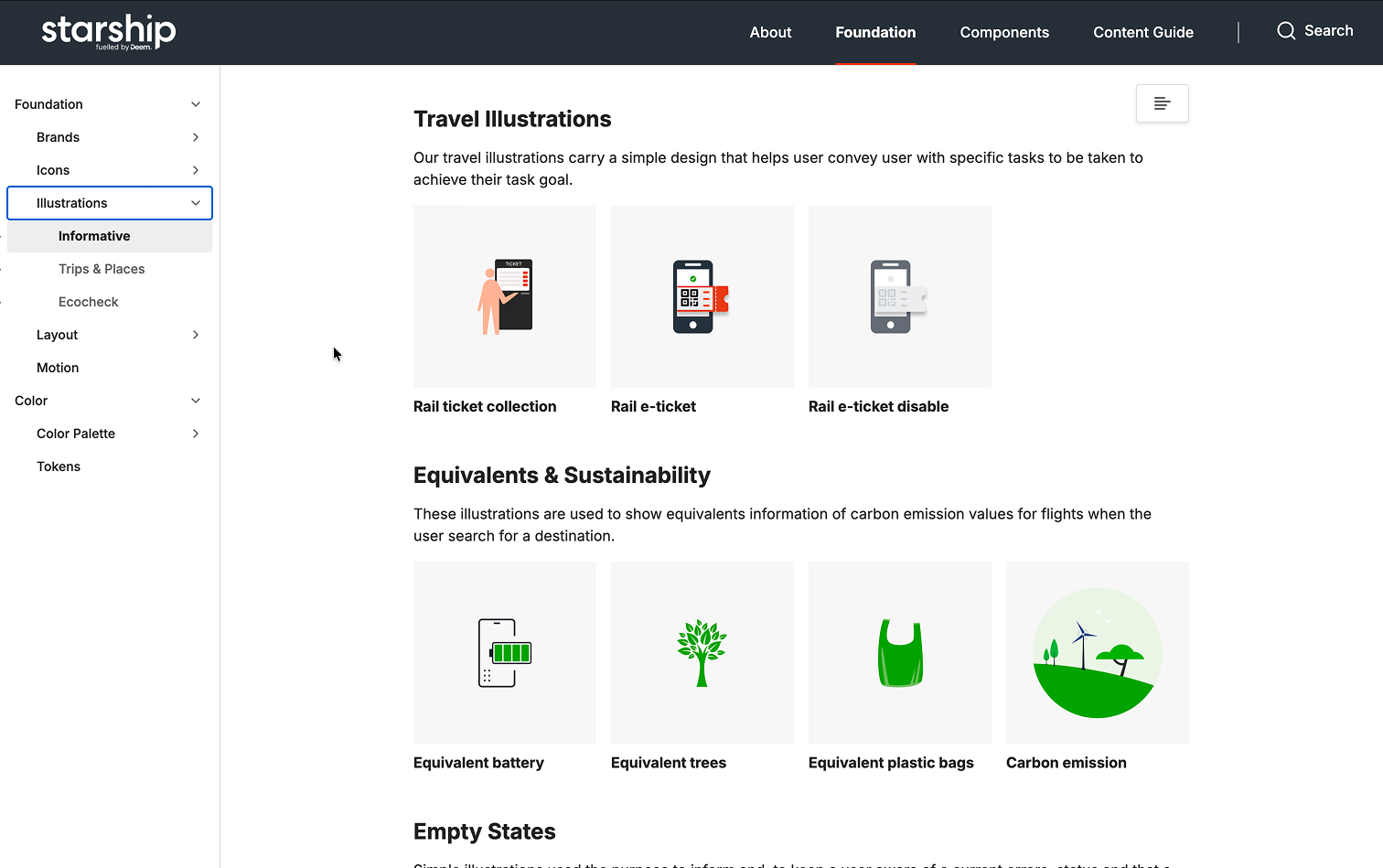
Cards & UI Components — Flight, hotel, trip cards · Buttons, inputs, chips, and status badges
Every component is variant-aware, accessible by default, and documented before it ships. If it's not in Storybook, it doesn't exist.
— Component contribution standardConnecting Design and Development
Three tools. One shared truth.
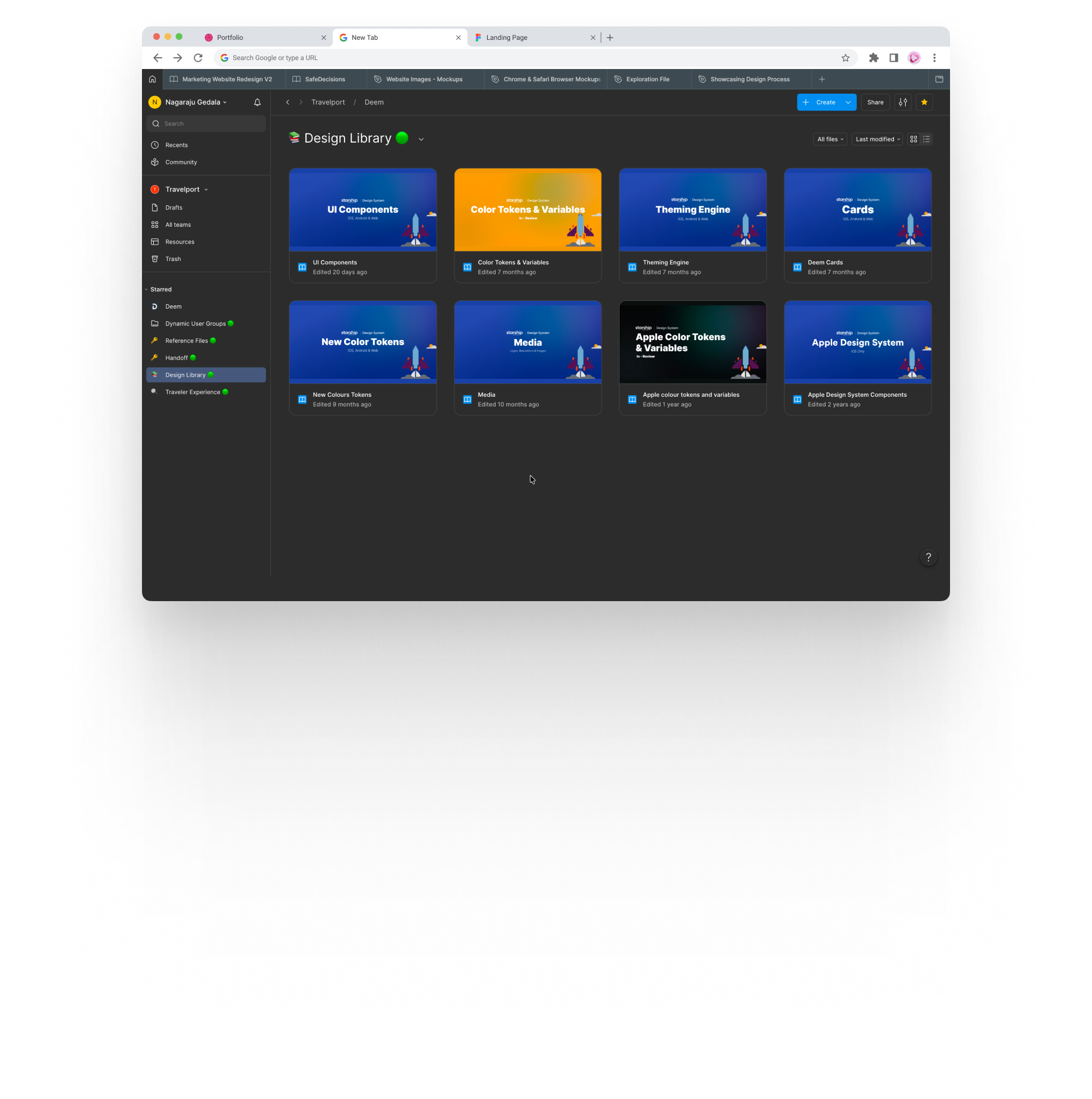
Starship lives in three places simultaneously — Figma, Storybook, and Zeroheight — always in sync, so no team works from stale information.
Token Update
Designer changes value in Figma
Review
System team reviews + a11y check
JSON Export
Tokens exported via Style Dictionary
Storybook
Component updated and tested
Released
Deployed to Web, iOS, and Android
Design Handoff — Annotated Figma files with token references, spacing specs, and accessibility notes
Documentation — Component guidelines, do/don't examples, accessibility specs, and content standards on Zeroheight
Cross-Platform Consistency
One language. Three native implementations.
Starship respects each platform's conventions — Web, iOS, and Android each have distinct patterns. The system honors those rules while keeping the experience consistent across all three.
Web
Responsive across 4 breakpoints. Keyboard-first. Dense data patterns for power users managing multiple travelers.
- Responsive grid with 4 breakpoints
- Full keyboard navigation
- Dense data patterns
- Storybook component library
iOS
Apple HIG foundations. Thumb-zone optimized layouts. Dynamic Type for accessibility. SF Symbols integration.
- Apple HIG compliance
- Dynamic Type support
- 44pt minimum touch targets
- SF Symbols integration
Android
Material 3 foundations. Adaptive layouts across a diverse screen size range. TalkBack and switch control fully supported.
- Material 3 foundations
- Adaptive layout system
- TalkBack & switch control
- Dynamic Color theming

Desktop Layout — Responsive 4-column grid, keyboard-first navigation, and dense data patterns for Web
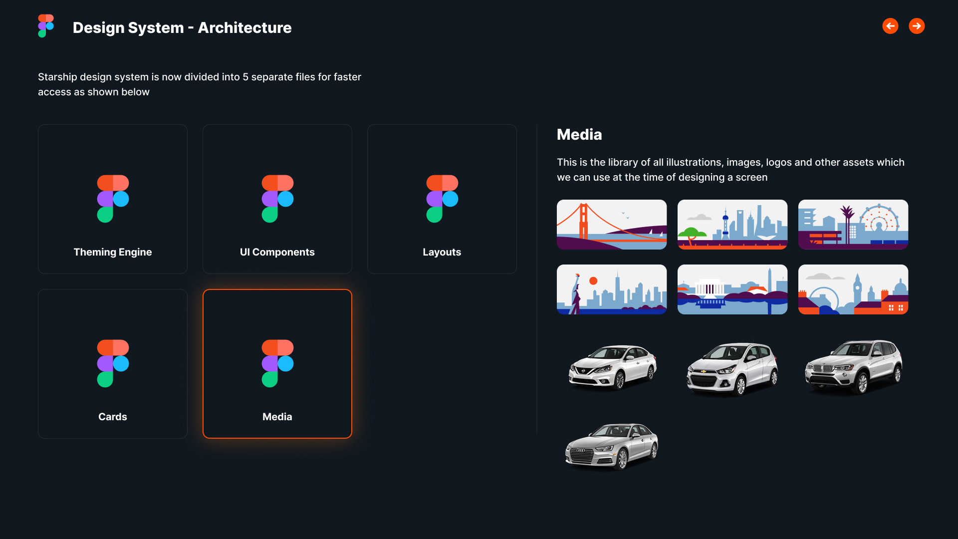
Media Components — Consistent image, icon, and media handling across all three platforms
Governance & Contribution
A system that grows with intention
The hardest part of a design system isn't building it — it's sustaining it. Starship's contribution model lets any team propose additions while keeping the system coherent and well-documented.
How teams contribute
Contribution is open but structured. Propose → Review → Accessibility Audit → Document & Release. Lightweight enough to encourage participation, rigorous enough to maintain quality.
Governance principles
Governance isn't about saying no. It's about saying yes in a way that scales — lower friction than going it alone.
Quarterly reviews
12
Acceptance rate
68%
Avg. release
8d
A Living Ecosystem
Not a kit. Not a rulebook. A living system.
Starship is the connective thread across design, engineering, quality, content, and brand — keeping teams aligned as the product grows.
Starship
The connective layer across Deem's product organization
Design
Figma libraries, theme engine, component foundations
Engineering
Storybook, JSON tokens, cross-platform implementation
Accessibility
WCAG 2.1 AA standards baked into every component
Content
Microcopy guidelines, tone of voice, communication principles
Brand
Visual language, color philosophy, typography standards
Product
Release criteria, QA standards, onboarding reference
The most valuable thing Starship created wasn't a component library. It was a shared understanding of what Deem looks like, sounds like, and feels like — across every team that builds it.
Impact & Reflection
What a shared system makes possible
The real impact of Starship is in what stopped happening — alignment meetings, duplicate work, onboarding friction.
Team alignment
Designers working from a single shared source
Platform coverage
Web, iOS, Android — one coherent experience
Onboarding
Ramp time for new designers and developers
Lessons learned
Culture first
Adoption is a design problem
The best design system in the world fails if teams don't use it. We invested as much in making the system easy to adopt as we did in building it. The contribution model, the documentation, the Figma library — all designed to be the path of least resistance.
Systems thinking
Tokens before components
Every component decision is downstream of a token decision. Investing in a rigorous token architecture at the start saved us from cascading rebuilds every time the brand or product direction evolved.
Reflection
The system is never finished
Starship taught me that the most important quality of a design system isn't its completeness — it's its maintainability. A system that 10 teams trust and actively contribute to is worth more than a perfect system that sits on a shelf.
One language.
Powering every traveler experience.
Starship created the shared foundation that let Deem's teams build faster, more consistently, and with more confidence — across every platform, every release, every team.