From a 20-year-old legacy platform to a modern, mobile-first, accessible travel ecosystem. Every decision rooted in research, every pixel aligned to purpose.
38%
Faster booking
92%
Policy compliance
4.6★
User satisfaction
31%
Fewer support tickets
My Role
Lead UX Designer
Platform
iOS · Android · Web
Timeline
2021 – Present
Team
Product · Engineering · Research
01 · Problem Space
A 20-year-old platform breaking under modern demands
Deem's classic platform served enterprise travel for two decades, but corporate travellers had evolved. They expected the simplicity of consumer apps, embedded sustainability insights, and a consistent experience across all devices — none of which the legacy system could deliver.
🗺️
Seat Selection
Confusing at Checkout
Users wanted upfront seat selection before reaching checkout, causing frustration and abandoned bookings.
📅
Date Flexibility
No Flexible Date View
Travellers struggled to compare flight dates. The platform lacked flexible date options, forcing repetitive searches.
📋
Policy Enforcement
Inconsistent Policy Filtering
Out-of-policy flights appeared despite active filters, eroding trust and creating compliance headaches for travel managers.
⚡
Task Speed
363 Seconds to Book
Classic Deem required 363+ seconds for a standard trip booking. Travellers constantly switched to consumer apps instead.
Classic Deem
Legacy pain points
Fragmented UI — no visual consistency across screens
Desktop-only, no mobile-first thinking
Multi-destination trips default to higher prices
Search & filter mismatches cause confusion
363 sec avgHigh support tickets~71% compliance
New Deem (Starship)
Consistent · Cohesive · Coherent
Consistent — looks like it can fit together
Cohesive — fits and works together
Coherent — works together to fulfil an intention
Mobile-first across iOS, Android & Web
125 sec avg31% fewer tickets92% compliance
02 · Research & Discovery
Listening to travellers at every stage of the journey
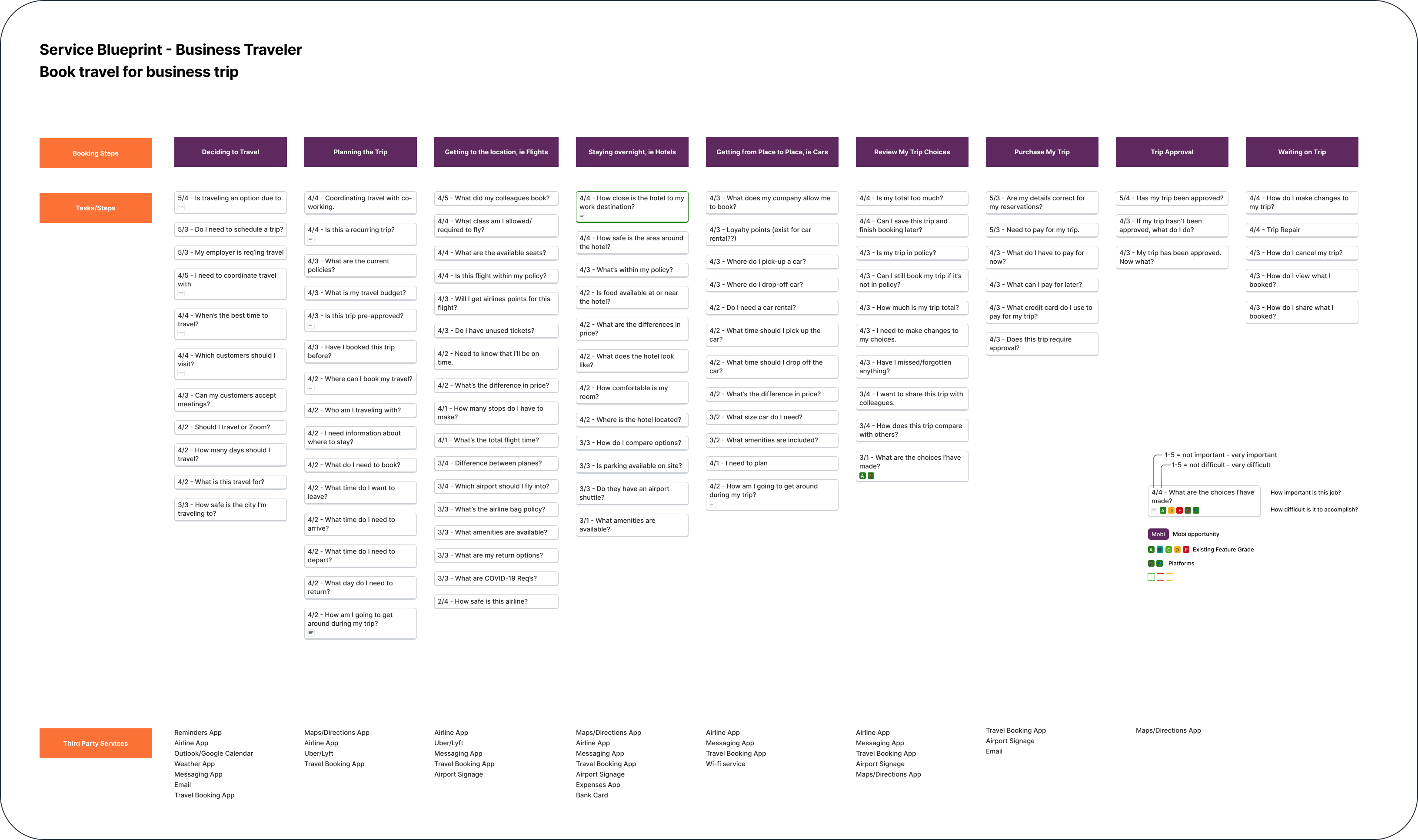
We mapped the full business travel experience — from deciding to travel to waiting on trip approval — through a comprehensive service blueprint. Customer feedback was clustered using affinity mapping to surface the highest-impact problem clusters.
Business Traveller Journey — 9 Key Stages
✈️
Decide
Is travel necessary?
📋
Plan
Budget & policy check
🛫
Flights
Search & compare
🏨
Hotels
Location & amenities
🚗
Cars
Pick-up & drop-off
🔍
Review
Check choices
💳
Purchase
Pay & confirm
✅
Approval
Manager sign-off
⏳
Wait
Monitor changes
Service Blueprint · Business Traveler — Book travel for a business trip across 9 stages
Customer Feedback Affinity Mapping — Clustered themes from 200+ traveller interviews and in-app feedback sessions
Key findings from research
Seat Selection
Users want upfront seat selection, not a forced afterthought at checkout. Confusion drives abandonment.
Policy Enforcement
Inconsistent enforcement of flight pricing and policy is frustrating — out-of-policy flights appear despite active filters.
Multi-Destination Issues
Multi-location trips default to higher-priced tickets and lose flexibility compared to single-destination bookings.
Search & Filter Mismatches
Filters and sorting don't always match user criteria, causing difficulty in finding relevant flights and hotels.
Airport Options
Limited flexibility in selecting nearby airports frustrates users when preferred airlines aren't available.
Layover Visibility
Users want upfront visibility of layover times and airports, plus nearby alternative options if preferred airlines aren't available.
"
I need to see seat options before I commit to a flight — not after I've already spent 5 minutes filling out details.
Business Traveller
Frequent flyer, Enterprise client
"
Out-of-policy options keep showing up even when I've set the filters. It makes me not trust the tool at all.
Travel Manager
Fortune 500 company
"
I just use Kayak and book myself. Classic Deem takes too long and doesn't show me what I actually need.
Road Warrior
Sales consultant, 40+ trips/year
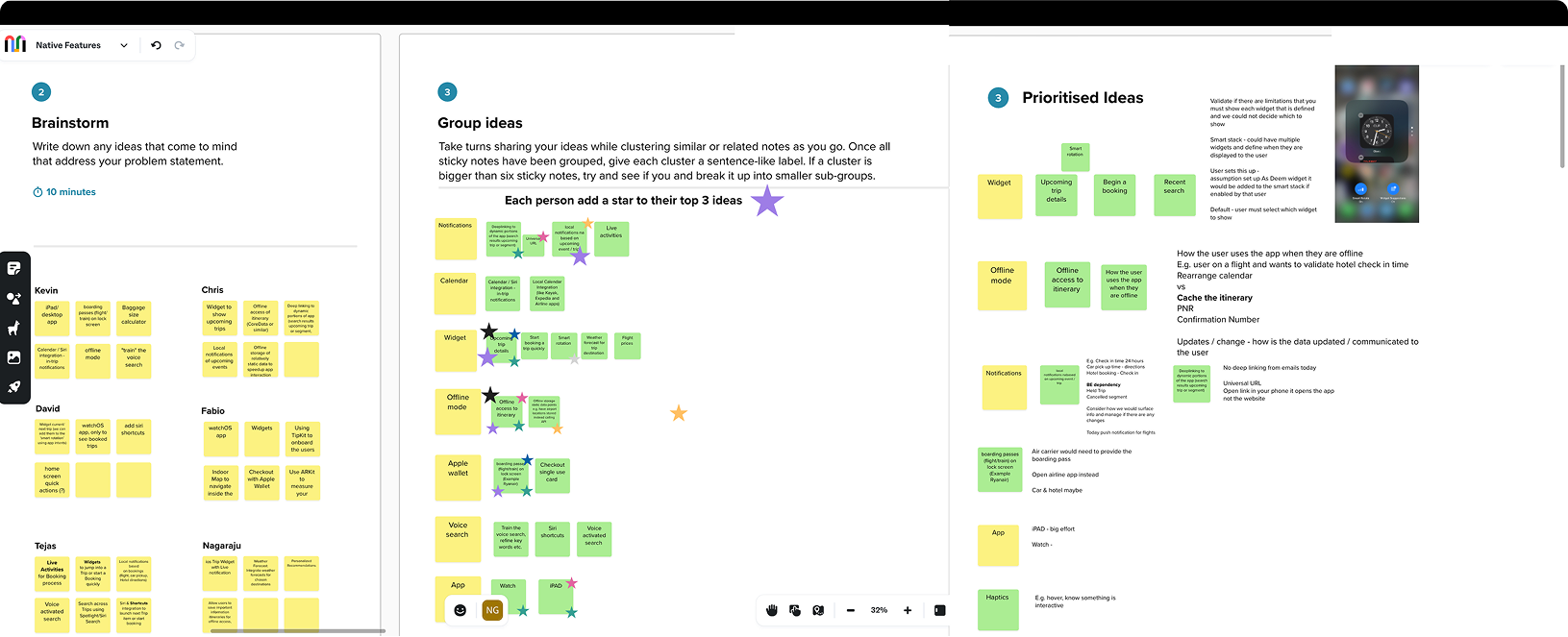
Design Sprint — Brainstorm (Step 2), Group Ideas (Step 3), and Prioritised Ideas (Step 3) from cross-functional workshop
03 · Design Strategy
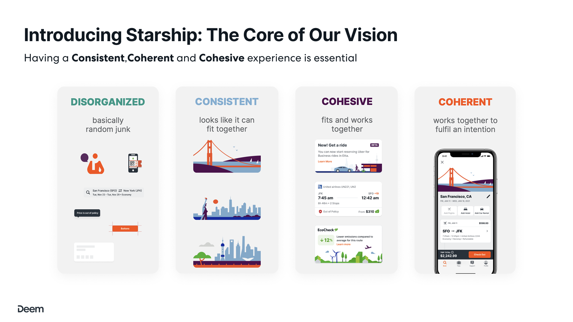
Introducing Starship — the core of our vision
We defined three design pillars for the Starship design system: Consistent (looks like it can fit together), Cohesive (fits and works together), and Coherent (works together to fulfil an intention). Everything from components to interactions had to pass this test.
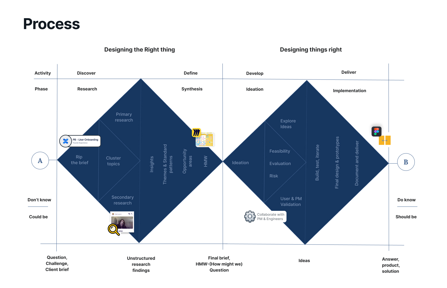
Design Process — From Discovery & Research through Ideation, Prototyping, Testing, to Final Delivery
Starship Design Philosophy — from Disorganised to Coherent across all touchpoints
🎯
Pillar 01
Traveller-Centred
Every flow built around the traveller's mental model — not the backend data structure or legacy constraints.
📱
Pillar 02
Mobile-First
Designed for iOS and Android as primary surfaces, then adapted upwards to web — not the reverse.
🔍
Pillar 03
Progressive Disclosure
Limit onscreen controls. Surface secondary details only when needed, reducing cognitive load across all tasks.
♿
Pillar 04
Inclusive by Design
Accessibility baked in — WCAG 2.1 AA, cognitive load reduction, and semantic markup from day one.
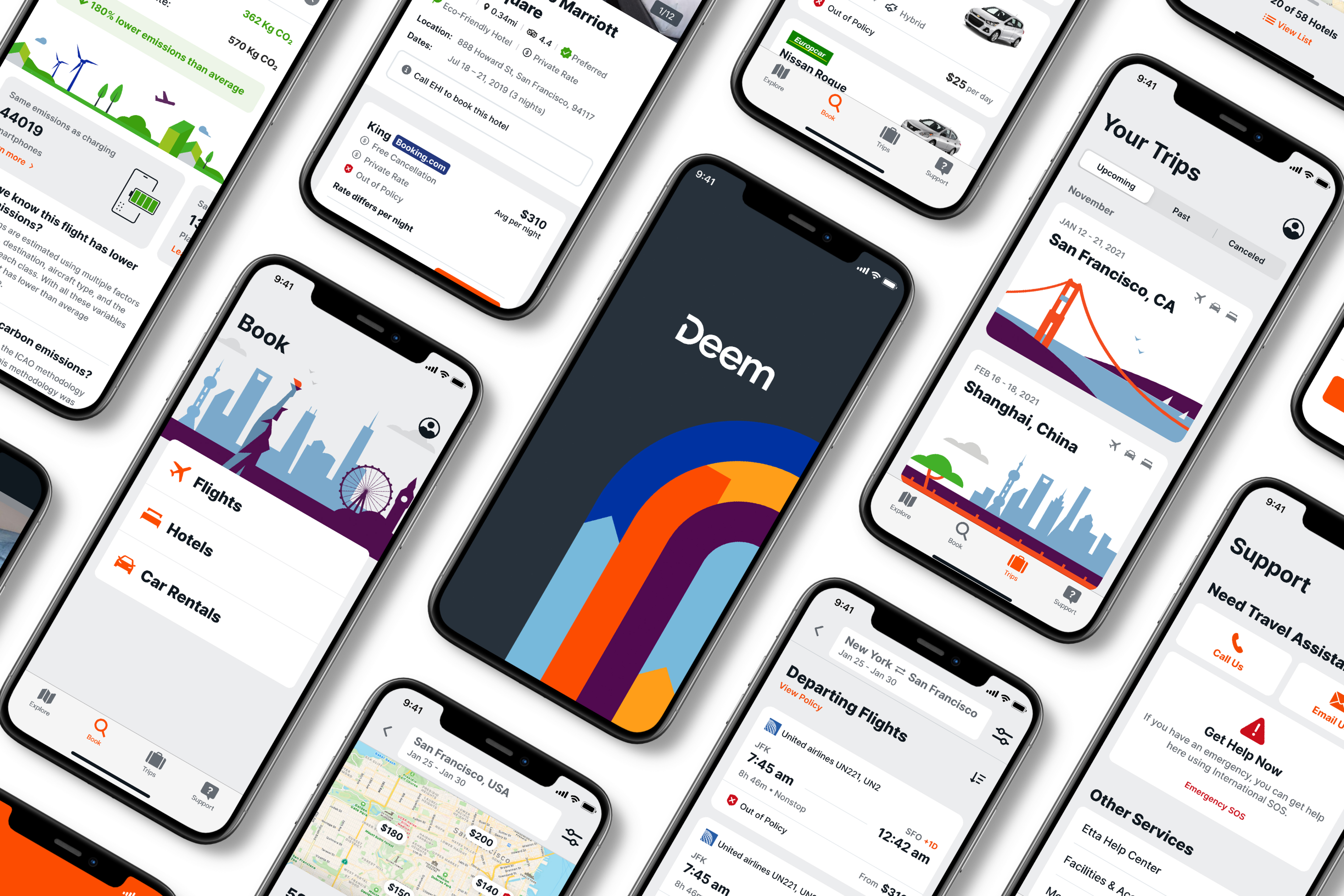
04 · Key Features
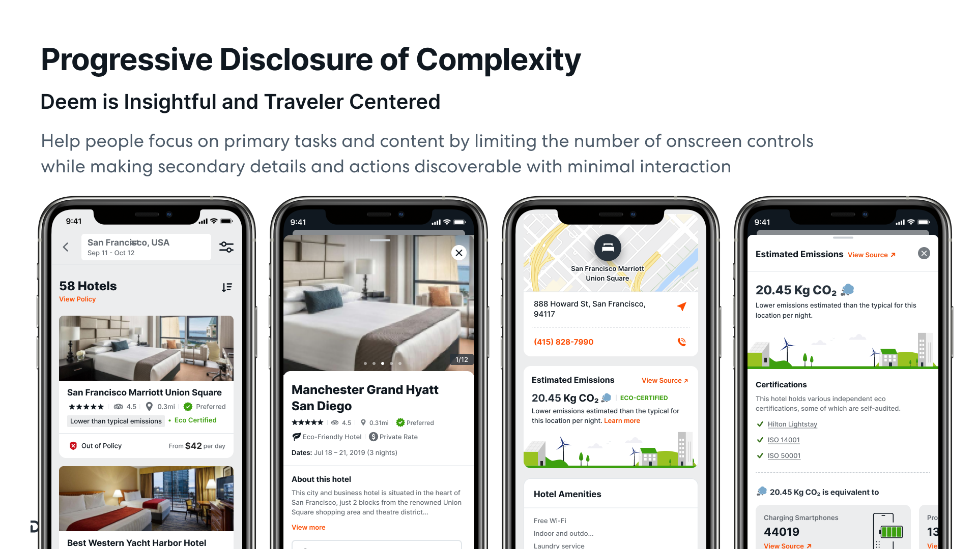
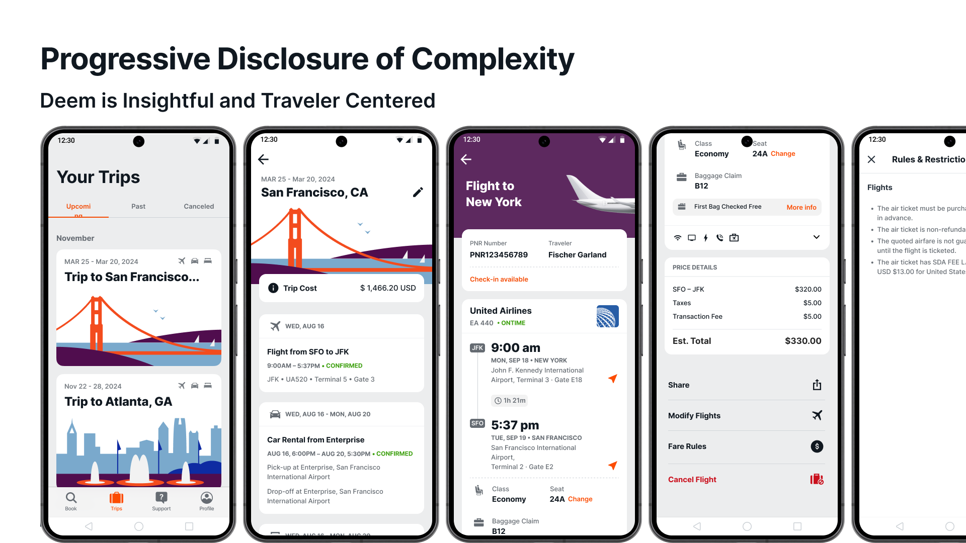
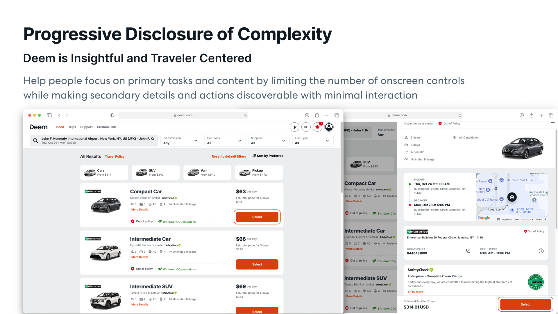
Progressive disclosure across every surface
Help travellers focus on primary tasks by limiting onscreen controls, while making secondary details and actions discoverable with minimal interaction. This principle drove every screen from flights to hotels to car rentals.
Hotels on Mobile — 58 Hotels list → Hotel detail → Map & address → EcoCheck emissions breakdown
Trip Management — Upcoming trips → Trip detail ($1,466.20) → Flight status (ON TIME) → Seat 24A → Fare rules & restrictions
Car Rentals on Web — Enterprise list view with map, pick-up/drop-off details, SafetyCheck badge, and supplier contact info
🛫
Flights
Smart Search with Recent History
Book flights faster with intelligent recent-search suggestions, round-trip/one-way/multi-city toggle, and upcoming trip cards surfaced on the home screen.
New Deem booking time
New Deem125 sec
Classic Deem363 sec
🌿
EcoCheck
Carbon Emissions at a Glance
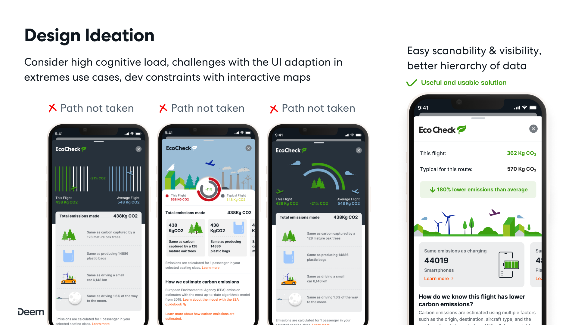
Every flight and hotel shows estimated CO₂ emissions, eco-certifications, and equivalent comparisons — like charging 44,019 smartphones — to help travellers make greener choices.
EcoCheck · This flight
This flight362 Kg CO₂
Typical route570 Kg CO₂
🏨
Hotels
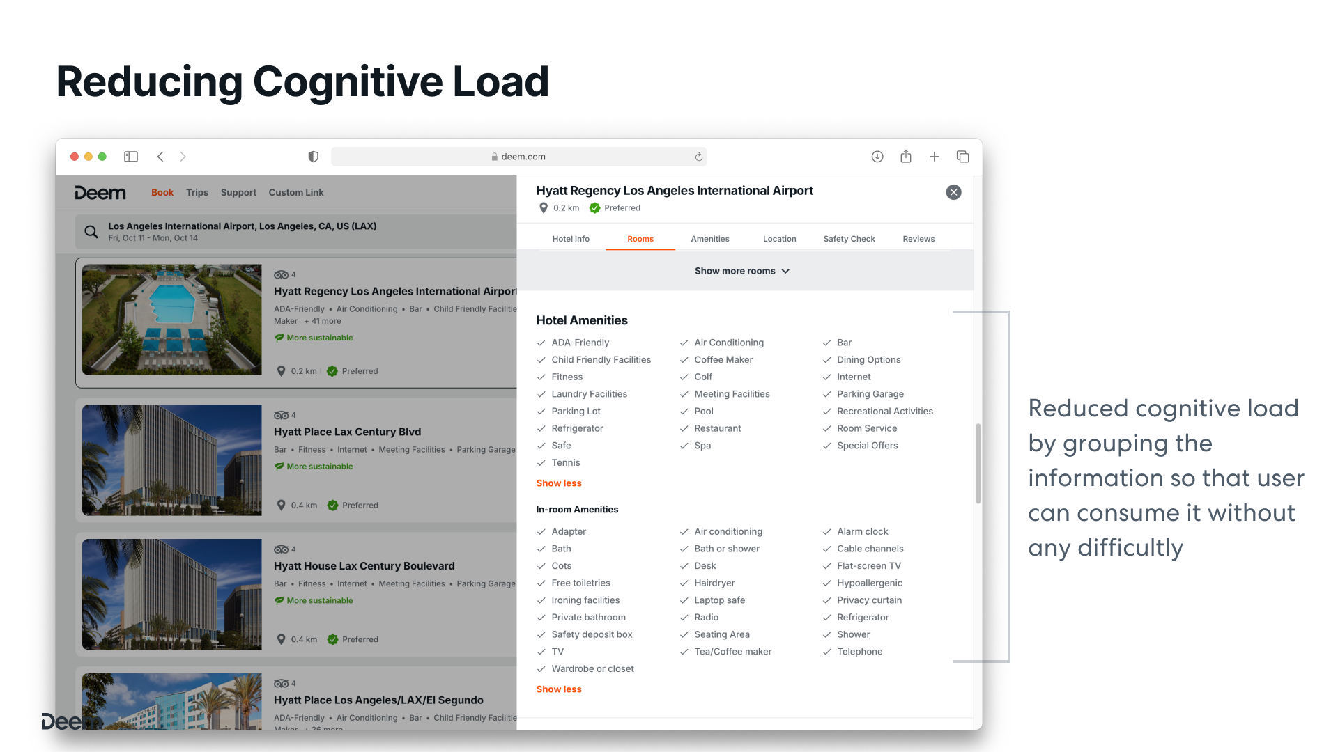
Reduced Cognitive Load
Hotel amenities, rooms, safety checks, and reviews grouped into clear tabs. Users can scan and consume complex information without difficulty — critical for cognitive accessibility.
🚗
Car Rentals
Policy-Aware Car Search
Cars categorised by class with SafetyCheck verified badges, policy indicators, CO₂ comparison, and pick-up/drop-off map — all in a single progressive panel.
Car rental · Policy status
Compact Car (Nissan Versa)Out of Policy
Estimated 5 days$314.01 USD
EcoCheck Design Ideation — Three paths not taken (bar charts, donut charts, gauge charts) vs. the chosen solution: easy scanability, better data hierarchy
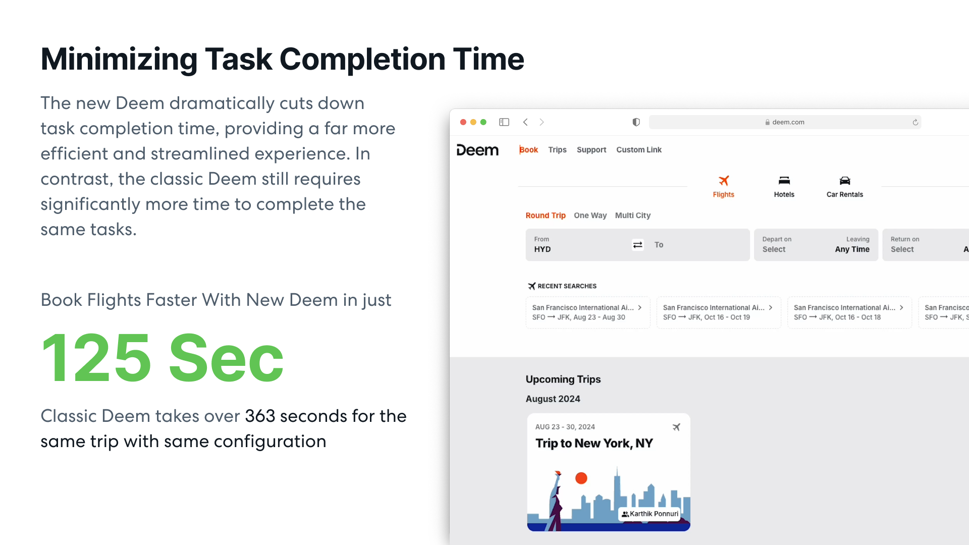
Minimising Task Completion Time — New Deem books a flight in 125 sec vs. 363 sec in Classic Deem
Classic Deem
363 sec
Average time to complete a standard corporate booking with the legacy platform — requiring significantly more clicks and navigation.
New Deem (Starship)
125 sec
Dramatically faster with smart search, recent history, inline policy guidance, and a streamlined checkout flow.
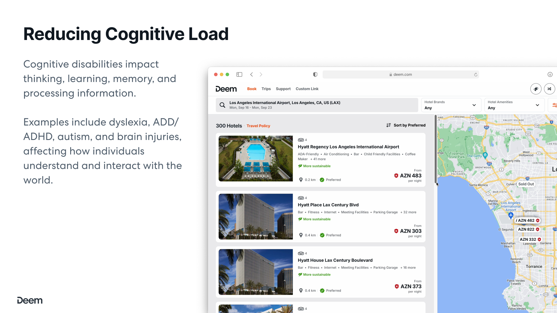
05 · Accessibility & Cognitive Load
Designing for every traveller
Cognitive disabilities impact thinking, learning, memory, and processing information. Examples include dyslexia, ADD/ADHD, autism, and brain injuries — affecting how individuals understand and interact with the world. We designed Deem to be usable by all.
Reducing Cognitive Load — Hotel list + map view together, reducing the mental effort of understanding location context
Grouped Information Architecture — Hotel Info, Rooms, Amenities, Location, Safety Check, Reviews tabs reduce cognitive load by separating concerns
WCAG AA
Full 2.1 AA compliance across all surfaces
4+
Tab groups per hotel to separate complex data
3×
Fewer required taps to access critical flight info
06 · Outcome & Impact
Measurable results across every metric
The Starship redesign delivered meaningful improvements for travellers, travel managers, and the business. From task speed to policy compliance, every KPI moved in the right direction within six months of launch.
Policy-compliant bookings. Up from ~71% on Classic Deem, driven by inline guidance and clear indicators.
User Satisfaction
4.6★
App store rating across iOS and Android. Up from 3.2 on the legacy mobile experience.
Support Tickets
31%
Fewer support requests. Clearer UI and progressive disclosure reduced confusion and help-seeking.
EcoCheck Adoption
2×
More eco-certified hotel selections after surfacing sustainability data prominently in search results.
Design System
3×
Faster feature delivery after Starship component library reached full coverage across all platforms.
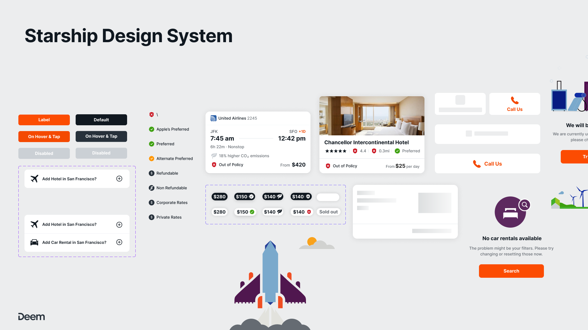
Starship Design System
A unified design system built to scale
Starship powers iOS, Android, and Web — built for consistency, accessibility, and speed of iteration. Every component, token, and pattern documented and production-ready.
Starship Design System — Components including buttons, policy indicators, flight/hotel cards, and contextual empty states
Full Case Study
Starship Design System
Tokens, components, documentation, and governance — the complete story of how we built a design system from scratch for Deem across iOS, Android, and Web.